Color Psychology in Home Interior Design
In March 2026, Color Psychology has transitioned from mere “decorating advice” into a science of Emotional Architecture. As homes continue to serve as multifunctional hubs for work, rest, and health, designers are using specific hues to “program” the mood of each room.
The 2026 trend is defined by Restorative Tones—moving away from high-contrast grays toward colors that mimic the natural world and provide a “mental pause.”
1. The 2026 “Hero” Palettes
According to industry leaders like Pantone and Sherwin-Williams, 2026 is the year of Visual Restraint and Grounded Authenticity.
- Cloud Dancer (Pantone 2026): A sophisticated, soft off-white designed to reduce sensory overload. Psychologically, it conveys clarity and balance, making it the ideal base for high-tech, multifunctional spaces.
- Restorative Darks: Deep plums (like Divine Damson), moody burgundies, and “nocturnal” blacks are being used in bedrooms and libraries to foster Introspection and a sense of “cocooning” safety.
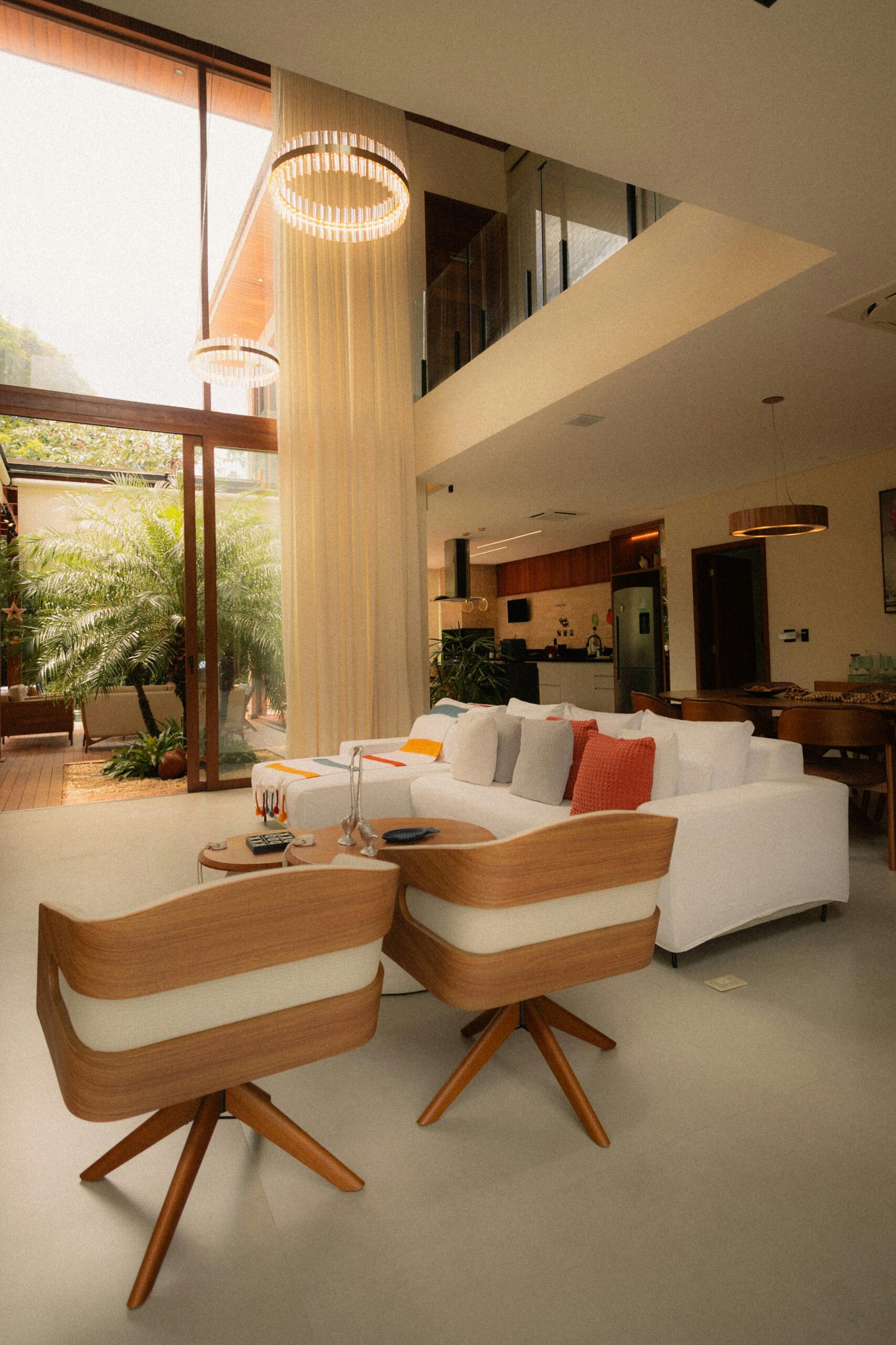
- Sunbaked Earth Tones: Terracottas, ochres, and “Digital Clay” provide emotional security and grounding. These colors are scientifically linked to reduced stress levels as they mimic the “resilient” palettes of the natural earth.
2. Room-by-Room Psychological Programming
In 2026, we select colors based on the Neurological Output we want from a space.
| Room Type | Recommended 2026 Hue | Psychological Effect | Why it Works |
| Home Office | Sage Green / Deep Teal | Focus & Concentration. | Green is a “mediator” between stimulation and rest; Teal promotes mental balance. |
| Bedroom | Muted Indigo / Lavender | Decompression & Sleep. | Blue lowers heart rate; Lavender promotes creative dreaming and tranquility. |
| Kitchen | Pistachio / Warm Mustard | Appetite & Energy. | Yellows stimulate logic and optimism; Green suggests freshness and health. |
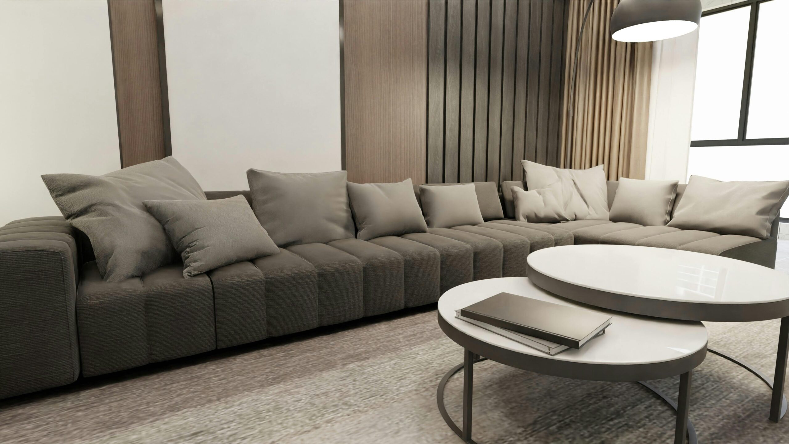
| Living Room | Warm Beige / Clay Taupe | Connection & Safety. | “Human” neutrals foster a sense of belonging and make long stays more comfortable. |
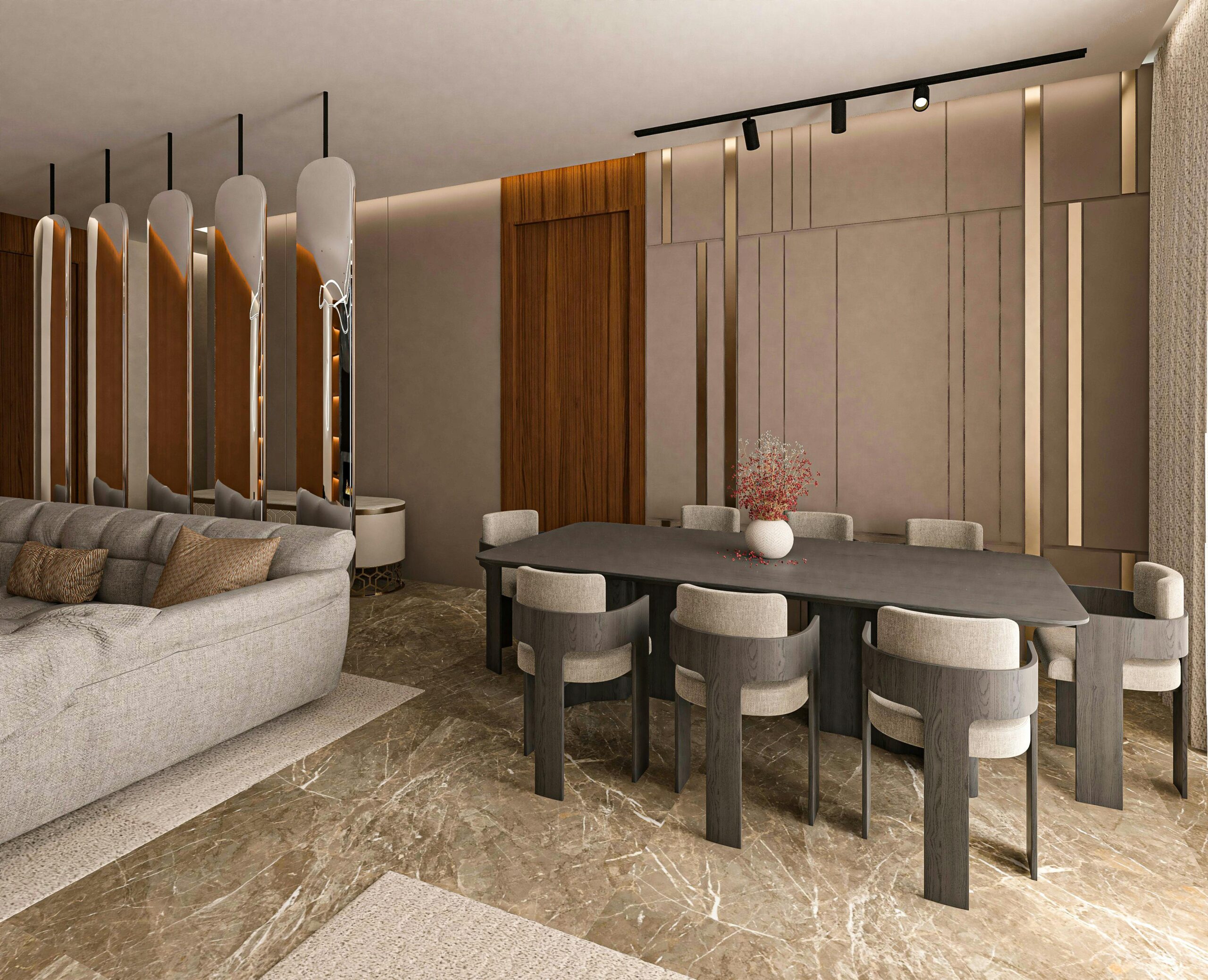
| Dining Room | Deep Reds / Burgundy | Conversation & Intimacy. | Red stimulates the appetite and encourages social interaction. |
3. The 2026 “Tech-Color” Synergy
A major shift this year is how color interacts with AI-Driven Lighting.
- Circadian-Responsive Paint: Designers are choosing “Misty” and “Frosted” tints that reflect light differently as your smart bulbs shift from blue-heavy morning light to amber evening light.
- Digital Lavender: A cool-toned purple that represents the bridge between the “analog” home and “digital” life—calming yet futuristic, perfect for gaming rooms or creative studios.
4. Implementation Rules: The 60-30-10 Rule
To maintain psychological balance without overwhelming the senses, 2026 designers stick to this classic ratio:
- 60% Dominant Color (Walls/Large Rugs): Usually a neutral like Cloud Dancer or Warm Ivory.
- 30% Secondary Color (Upholstery/Curtains): A character color like Sage Green or Terracotta.
- 10% Accent Color (Art/Cushions): A bold “pop” like Sapphire Blue or Mustard to provide a mental spark.
5. Summary: Choosing Your “Atmospheric Goal”
- For Productivity: Lean into the Cool Spectrum (Blues/Greens).
- For Socializing: Lean into the Warm Spectrum (Yellows/Oranges).
- For Recovery: Lean into Earth Neutrals (Beiges/Clays).
2026 Pro-Tip: Always test your paint swatches at 10:00 AM and 8:00 PM. The “Metamerism” (how color changes under different light) in modern 2026 pigments can make a “Restorative Plum” look like a “Hostile Black” if your lighting isn’t properly calibrated.
Related Posts
Luxury Home Interiors: Design Elements and Trends
Wall Décor and Art Placement in Modern Homes